How To Actually Read Your Amazon SQP Report Without Drowning
Read more
.png)
Use Amazon SQP to track purchase share, click share, impression share, and the total-versus-brand-count gap. Ignore low-value metrics and focus on queries with the biggest growth upside.
Summarize in ChatGPT
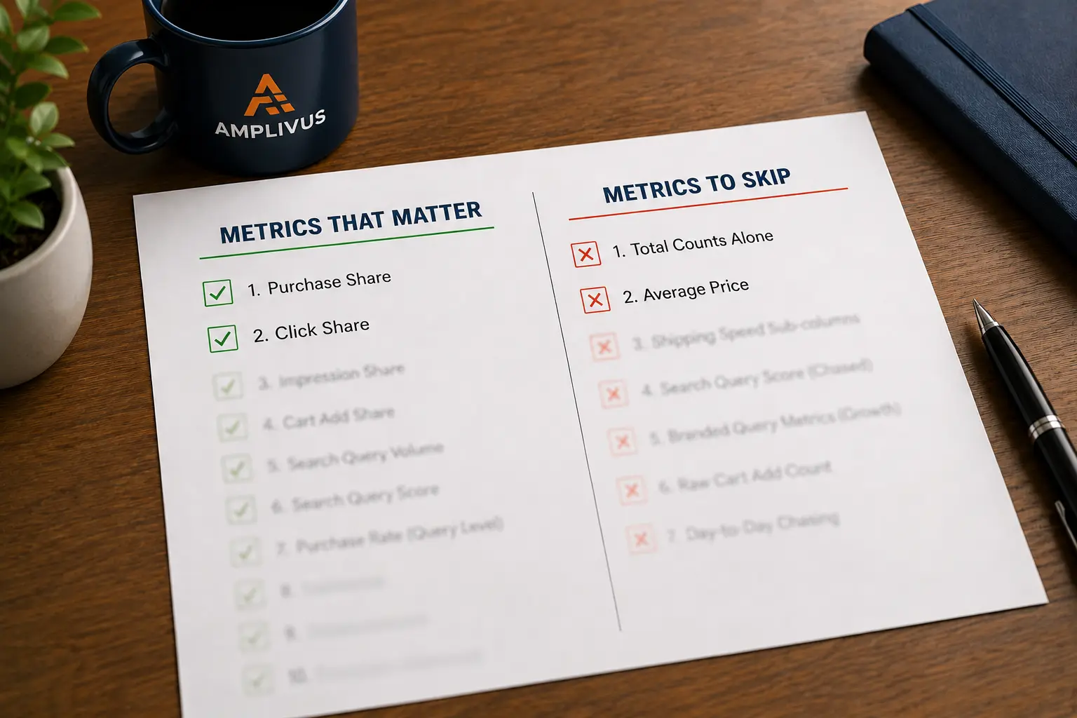
A working shortlist for the Search Query Performance report: which columns earn a weekly decision, which to skip, and the single read that finds money.
You open the Search Query Performance report expecting answers. Instead you get a grid that runs off the side of the screen.
Dozens of columns: counts, shares, rates, prices, shipping speeds.
Somewhere in there is the number that tells you whether your brand is winning or quietly bleeding sales, and you cannot tell which one it is.
Here is the short version before the long one. About ten of those columns deserve a place in your weekly routine. The rest are either context you glance at twice a year or noise you can skip entirely.
This guide splits them for you, attaches a benchmark to the ones that count, and shows you the one read that turns the whole report from a spreadsheet into a list of opportunities with dollar signs attached.
Most sellers fail here not because the data is bad, but because nobody told them which numbers earn a decision and which ones just fill the screen.
Search Query Performance (SQP) is a report inside Amazon Brand Analytics. You reach it in Seller Central under Brands, then Brand Analytics, then Search Analytics.
It is open only to sellers enrolled in Amazon Brand Registry with a Brand Representative role, and it does not exist for Vendor Central accounts.
What makes it rare is the source. These are first-party numbers from Amazon itself, not estimates from a third-party tool.
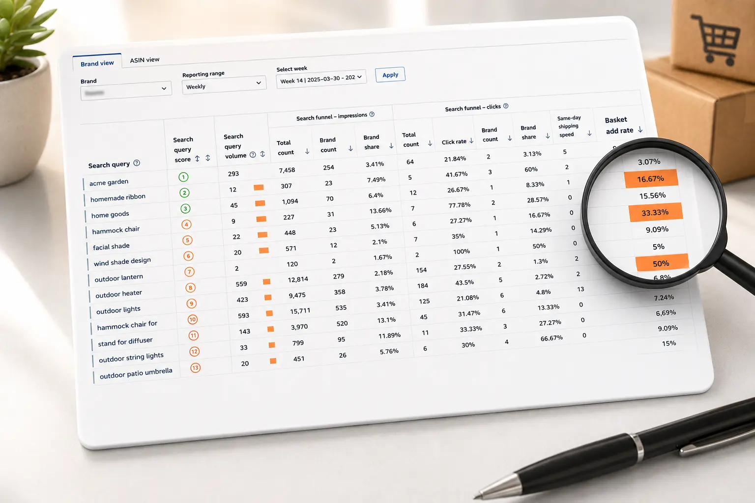
For each of your most relevant search queries, the report shows the full shopping journey: how many times the query was searched, how many times listings appeared, how many got clicked, how many were added to cart, and how many sold. Then it shows your slice of each of those stages against the whole market.
That last part is the point. SQP is one of the few places Amazon tells you not just what you did, but what the entire category did on the same search term. If you have never run the scan itself, our guide on how to read your Amazon SQP report covers the 60-second version.
The columns look chaotic until you notice they repeat in a pattern. Every stage of the funnel, impressions, clicks, cart adds, and purchases, gets the same three-part treatment: a total count for the whole market, your brand's count, and your share as a percentage.
Read it left to right and it tells a story.
A shopper types a query. Listings appear (impressions). Some get clicked. Some clicks become cart adds. Some cart adds become purchases.
At each step, customers fall away. Your job is to find the step where you fall away faster than you should, because that gap is where money is sitting.
Once you see the report as a funnel with a share number bolted onto every stage, the noise quiets down on its own.
These are the metrics worth a weekly look. Each answers a question you can act on, and each comes with a rough benchmark so you can judge your own number instead of staring at it.
1. Purchase share. Your purchases on a query divided by all purchases for it. This is the closest thing SQP has to a scoreboard: how much of the actual money on a search term your brand captured.
On your own branded terms, aim high. Amazon publishes no official target, but many agencies treat roughly 80 to 90 percent on branded queries as healthy, and a much lower number is a warning that a competitor is conquesting your name.
2. Click share. Your share of all clicks on the query. When click share is low but the query matters, shoppers are seeing the category and choosing someone else's listing to open.
That points to your main image, title, price, or rating, the things that win the click before anyone reads your bullets.
3. Impression share. Your share of all impressions for the query. Low impression share means you are barely in the race, and shoppers cannot click what they never see.
This is usually a ranking and advertising problem, not a listing problem.
4. Cart add share. Your share of all cart adds. This sits between interest and purchase, and it is the most overlooked metric in the report.
A strong cart add share with a weak purchase share often means price, reviews, or shipping is killing the deal at the last step, a leak our cart-add-to-purchase drop-off guide diagnoses in detail.
5. Search query volume. How many times the term was searched across Amazon in the period.
This is genuine demand data, and it lets you separate a query worth fighting for from one that looks nice but nobody searches.
6. Search Query Score. Amazon scores each query from 1 to 1000 by how important it is to your brand, where a score of 1 marks your top query. It ranks by sales contribution, not raw search count.
Used as a sorting tool to find your top revenue queries fast, it earns its place. Chased as a vanity ranking, it does not, which is why it appears on both lists in this guide.
7. Purchase rate (query level). Purchases divided by clicks for that query.
This is your query-level conversion rate, and it answers a sharp question: when shoppers do click my listing on this term, do they buy? A low number here is a detail page problem you can fix.
8. Click rate (query level). Clicks divided by impressions.
Read alongside impression share, it tells you whether your problem is visibility or appeal. Plenty of impressions with a weak click rate means the listing is not earning attention.
9. Cart add rate. Cart adds divided by clicks.
A useful early-warning signal, since cart behavior shifts before purchases do. Watch it on launch products to see whether interest is building.
10. Brand count against total count. Not a single column, but the comparison that matters most.
It gets its own section below, because it is where the report stops describing your performance and starts pointing at money you are leaving on the table.
Skipping data feels wrong. It is not. Reporting time is finite, and these columns rarely change a decision.
If you take one habit from this guide, take this one.
For any query, put the total count next to your brand count at the purchase stage. The gap between them is the opportunity, sized in actual orders.
Say a query shows 100,000 purchases across the market in a quarter, and your brand count is 100. Your purchase share is a tenth of a percent.
That gap is not a rounding error. It is 99,900 orders you are not getting on a term shoppers clearly use to buy.
Now compare that to a query where the total is 2,000 purchases and you already hold 1,400. There is far less room left to win there.
This single comparison reorders your entire priority list. Big total, small brand count, and proven purchase intent is the textbook target for new advertising and listing work.
It is the difference between optimizing a term you already own and chasing one where the category is spending money you never see.
These two get confused constantly.
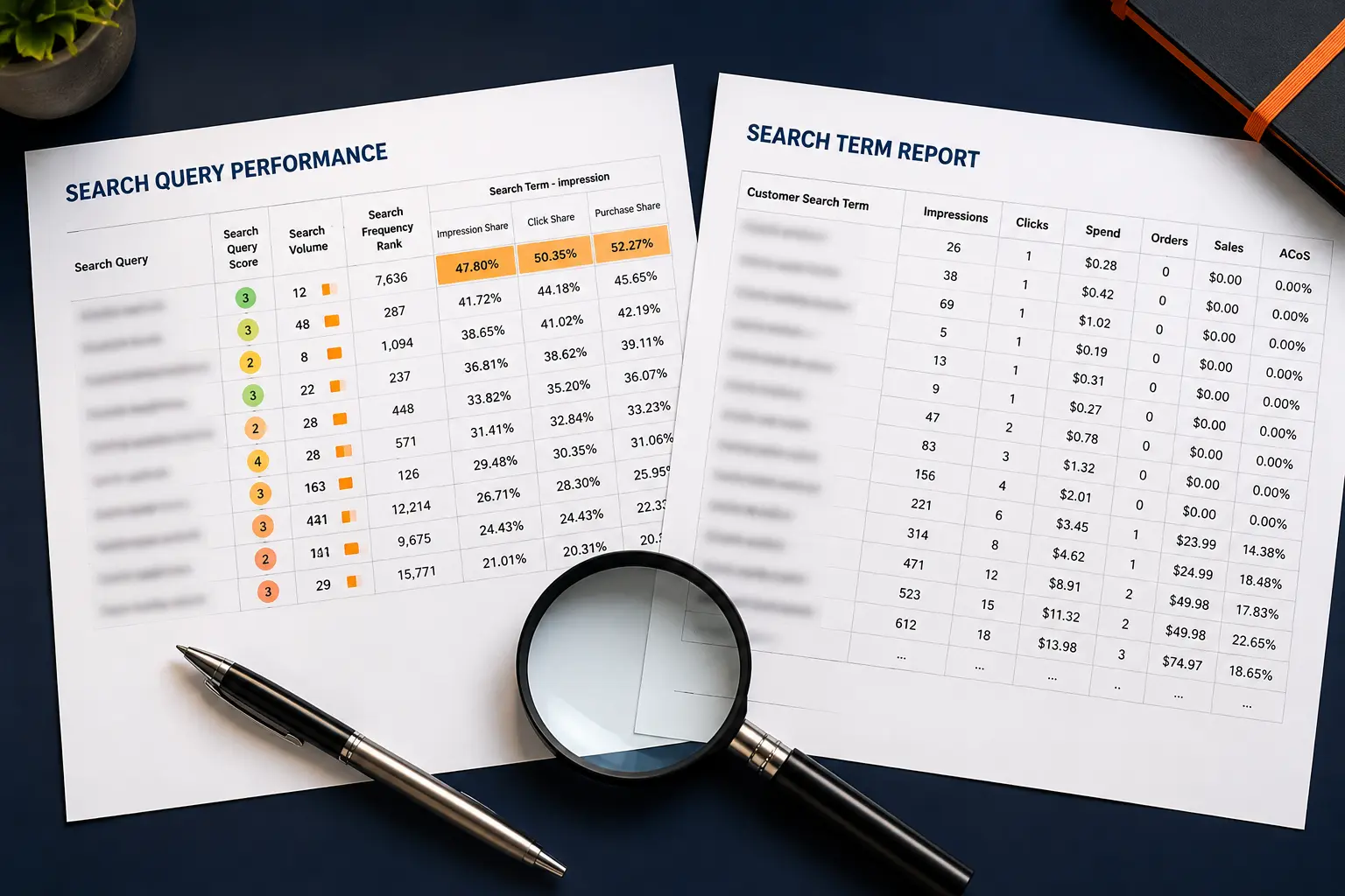
The Search Term Report lives in Amazon Ads and shows only queries that triggered your ads, plus spend and conversions, so it is your tool for campaign optimization and negative keywords.
SQP lives in Brand Analytics and shows organic and paid behavior across the whole market, so it is your tool for positioning and listing decisions.
Use the Search Term Report to manage your ads and SQP to understand your market. Our full breakdown on the SQP report versus the Search Term Report covers when to reach for each.
Cadence depends on how much you can actually act on. A smaller brand with a tight catalog does well with a monthly review, since weekly data on a handful of ASINs is mostly noise and the monthly view smooths it into something you can trust.
A larger brand or an agency managing real ad spend benefits from a weekly pass on top queries, watching share trends rather than single-week swings.
During a product launch, tighten to weekly regardless of size, because the early funnel shifts fast and cart add rate will warn you before purchases do.
For teams that need near real-time signals, the Search Query Performance API and Amazon Marketing Stream open faster access paths than the manual dashboard, though both come with throttling limits that cap how many ASINs you can pull per day.
Data is only worth the action it triggers. Start with the delta read: sort your queries by the gap between total count and brand count at the purchase stage.
Those are your highest-opportunity terms.
For each one, check where the funnel breaks. Low impression share points to advertising and ranking work, so harvest the term into your campaigns and push for organic placement.
Low click share with healthy impressions points at your main image, title, or price. Strong cart add share with weak purchase share points at reviews, pricing, or the detail page itself.
Then close the loop. Feed the high-opportunity, high-volume terms into Sponsored Products, refine bids where purchase rate is already strong, and pull spend off terms that draw clicks but never convert.
Where the gap is a competitor out-converting you on a shared term, a competitor analysis shows who and why. SQP tells you where the demand is.
Your campaigns and listings decide whether you capture it.
A few errors show up again and again. Reading branded queries as a win and stopping there, when strong numbers on your own name are table stakes that hide the growth living on category terms you do not yet own.
Reacting to a single week, when returns and cancellations appear to stay in the purchase data and the report uses fixed weekly periods, so one period is rarely the truth.
Tracking everything equally, so sellers who try to watch every column end up watching none of them well. Ignoring cart add share, the early signal hiding in plain sight, where the gap between cart adds and purchases is often the cheapest sale to recover.
And treating SQP and the Search Term Report as interchangeable, which leads to confident decisions built on the wrong data.
SQP rewards the seller who reads it consistently and acts on a small number of metrics, not the one who screenshots every column.
If your team is spending more time formatting the report than acting on it, that is usually a sign the analysis needs a clearer system around it.
As an Amazon PPC agency, Amplivus builds that system through PPC management and a free PPC audit that turns query-level data into ranking and conversion decisions, not another spreadsheet nobody opens.
You can also book a strategy session to walk your own numbers. The data is already yours. The advantage comes from what you do with it.

Know which queries deserve more budget, which metrics to ignore, and where your biggest market-share opportunities are hiding.
Our 24-hour Amazon PPC audit reveals missed search-term opportunities, wasted spend, and the metrics that deserve attention.